My blog has moved!

You should be automatically redirected in 8 seconds. If not, visit
www.greenislescrafts.com
and update your bookmarks.

Wednesday, July 29, 2009

The Envelope Please!

Random.org did our independent prize drawing.... and the winner is: Post 57!


Jasmina said... 57

What a neat ideas. Love it, especially the one with a candle.

Your giveaway is just the thing i need :)
I'm a follower on both of your blogs.

Jasmina


Congrats to Jasmina!


Ok, Ok, I can see you guys throwing down your tickets like you see people do at races on the movies. Hold on now.... another winner will be announced at the beginning of next week, so stay tuned!

Stampin' Lizbess Gets a Bloglift

This is quite possibly the happiest blog I've seen! Which is fitting because as I've gotten to know her, she is so very kind and genuinely a happy person.

Head on over to my design blog and see her new page!


Saturday, July 25, 2009

Royal Blog Tour

The Tour is now closed! Thank you for visiting. Blog Candy Winner will be announced soon!

Welcome to the Dusty Durango Tour. If thou art just beginning the tour, thee will be better served by beginning thy travels at the home Castle. Thee may reach it from here simply by clicking on my CROWN!


Welcome to the Dusty Durango Path of the Royal Blog Tour.

Ye are currently at Castle Number 7.


****** Blog Candy ******
I'm offering blog candy too! Scroll to the bottom to find out how to register for your chance to win something sweet!


My featured stamp set is a new hostess only stamp set called - Wings of Friendship. It lends itself well to a new technique that I'll be sharing with you today. Now, I know you don't want to read a bunch of stuff so I promise to keep it short! Now on to the projects.


Color Rocks!

This is a solid image stamp, so coloring directly onto the stamp with markers gives you a lot of room to play with the colors and shading. This is Rich Razzleberry(bird), Crushed Curry, Summer Sun and Dusty Durango on the flowers with certainly celery on the leaves and vines. His wings have some Dazzling Diamonds. The swirls on the background are a direct transfer techniqe using Crushed Curry on So Saffron card stock.


Grunge is Grand


I just love this new In Color Soft Suede! It's delish! The image is stamped in Whisper White Craft Ink on the Soft Suede Card stock. Ripped and roughed up, wadded up a few times and stepped on for good measure. Did I mention this is a project to get out allllllll your frustrations? *smirk* Then the edges and creases were inked with the Soft Suede.

The background paper is faux handmade paper. I used tissue paper to dab on several ink colors from the reinkers. Isn't it just fun?


Pop Ups Make Me Happy!


Ok, this is a stamped image that I made for a project that didn't make the cut for the tour. After I'd finished the other three, I just couldn't throw this guy away. so I made a very quick popup card. The background behind the bird really makes it look like he's welcoming the morning sun! It's just all the shades of yellow sponged onto Whisper White card stock. (darker as it goes toward the edges) Give this a try and you'll love how it looks around your images.


Faux Etching All-Aglow


Faux Etching Tutorial

I know, I know... what IS that? I developed it a long time ago and recently shared it with my local Jacksonville Starz group. Stay tuned for more info and a tutorial that I'll post in the days following the tour. It's so simple, you'll wonder why you didn't try it sooner!

Get your supplies ready and join me next week for a project you'll love to give as gifts for any occasion. You'll need a glass container with a smooth side, solid image stamp(s), versamark ink and marker, embossing heat tool, clear embossing powder and an embossing buddy.


****** Blog Candy ******
I'm offering a custom blog banner to at least one lucky winner! Here's what you have to do:
  1. Sign up as a follower on my design blog: Design ByTee
  2. Sign up as a follower here
  3. Leave a comment on this post
That's it! This candy is open to anyone and everyone who meets this criteria by July 28th at midnight! Good luck to you!

Once this path hath reached its end, thy royal coach will travel back to the Royal Blog Tour - Home Castle where more paths await thee!

The tour is now closed! Blog candy will be announced soon!

Royal Blog Tour ---- Tomorrow!


Start The Royal Blog Tour at the home page tomorrow and you'll get to enter for a chance to win a Big Shot Die Cut Machine! Woohoo!

The Royal Blog Tour is three days long, and you'll be happy it is! There are four tours - a total of 80 fabulous blogs!

But wait - there's more!

Blog Candy, Blog Candy, and more Blog Candy. Over 50% of the blogs on this tour are offering Blog Candy.

Check the Princess list on launch day. Every name with an asterisk next to it is offering blog candy.


That's not all! The Royal Blog Tour Home Page is offering their own Blog Candy. And it is -- a Big Shot Die Cut Machine!!!!

You'll have to work a bit for it as there are 20 clues that will be scattered among the 80 blogs. But won't it be worth it if you come away with a brand new Big Shot?

* This drawing is open to all countries represented by Princesses in this tour, including Canada and Australia!

Wednesday, July 22, 2009

For the Love of Ink

For the Love of Ink gets a bloglift!

Latisha is a delightful lady from California who asked for just a little help with her blog. I had a great time getting to know her while I pulled her design together.
She got a new animated banner, signature, watermark, two buttons for her sidebar and background.

Don't forget that I'm giving away a custom blog banner as blog candy! You can register for that this weekend, right here!

Monday, July 20, 2009

My Princess Interview

I did an interview for the Royal Blog Tour and they've posted it. I feel famous! Go check it out.

Did you notice my new look? Someone special wanted to know how to do something fun with text in photoshop. She ended up making the text that is in my new banner. Cute huh? So then I made this background while walking her through the steps. From there, a signature, Feedburner brand and finished banner were just ... needed!


Saturday, July 18, 2009

Blog Candy!


Mmmmm Who doesn't love sweet delicous candy? Ok, besides that guy? Exactly!


See the tour info to the right? Well if you visit me during the tour next weekend, you can sign up for a chance to win some yummy candy that is custom made just for you!


See you then and Good Luck!

Sticky Note Experiment

You have GOT to see this! If you have not seen it, you are in for a treat. If you have, then you know it's amazing!

EepyBird's Sticky Note experiment from Eepybird


Wednesday, July 15, 2009

My Princess Interview

Posted on The Royal Tour's Blog on Wednesday, July 15, 2009

Meet Teressa Thompson, Featured Princess

I would like to introduce Tee one of our wonderful princesses for the royal blog tour. Tee is multi talented and very proficient in Photo shop I recently had the opportunity to visit her blog and she has several great tutorials for Photo Shop! I asked her several questions and here are her answers.


How long have you been stamping?


I've been stamping for about 30 years. As a kid, I stamped images with everything that looked like it would leave a good impression. With rubber stamps? Probably about 15 years. With stamps that didn't belong to someone else? Just 4 years. Letter boxing got me started creating my own stamps and collecting stamp images. It wasn't long before I was using them in journals, on stationary and for kids projects and that sort of thing. You know how it is, Stamps have a way of working their way into our every day lives.


Where are you from?
I have lived in a lot of places on the map, but Jacksonville Beach, Florida is home. No other place is like it really. It's not a small town, but it feels like the best parts of one. You know the guy at the bank (Josh) and the gal at the grocery store (Mel). Things are a little slower, drivers are more courteous (the local drivers - that is) and everyone seems ready to exchange a hello or a smile. Flip flops are a valid part of any wardrobe. Oh, and as my oldest son says, "The beach is just right over there -->!!"


Do you have any other hobbies besides stamping?
OH my! I think it would be easier to say what I don't do! Right now, I'm doing computer graphics and playing around with photo editing. We also throw pottery on the wheel, Letterbox, Geocache, hike, bike (new one - as little one just learned to ride), sew, read, write and play in the sand on a fairly regular basis.


How long have you been with SU?
Stampin Up hooked me in December '08. I saw a you tube video using a word window punch and wanted one. Let me tell you, it's not easy to find at all. I must have gone to every craft store looking for it. Nada. Of course. Then I saw the coolest stamp pads on the planet. Dude, she squeezed the lid and it didn't break. Then she opened it and the ink was on the lid and she used it to color in her stamped image. Huh. Now I wanted that more than I wanted the punch. Luckily, I was able to snag the video off you tube and then edit it to get a blurry name off of ONE frozen image. Stampin Up!, a company I'd never heard of.A google later and I emailed Janet White. We talked about the discounts involved with signing up and here I am! Oh and yes... I do have my Word Window Punch now! *wink*


Do you want to share anything about your family with us?
I'm blessed with a wonderful family! We are a blended group with five kids. Three of our boys are grown and that leaves Joey (13) and Morgan (9) at home.


What is your favorite SU color?
Chocolate Chip. Wait.. um.. Brocade Blue. OH.. Rich Razzleberry. Ummm I could go on all day. Do I really have to choose? LOL


What is your favorite stamping technique?
The current favorite changes constantly. Learning new stuff is what I crave. However, I do love trying to replicate some of the things I can do on the screen on paper. My all time standby is watercolor painting; I love getting things out of classic ink that others swear you can only get from Copics. Classic ink is wonderful for Sumi-E by the way!


Is there any part of stamping or creating that you wish you knew more about?
There's always something to learn. My personal motto is, "Learning is a way of life." If we approach everything this way, we are open to the ideas that surround us. So, everything I don't know is what I am looking forward to learning. Relearning things is fun too!


What inspires you? or Where do you find inspiration?
Teaching inspires me. There's nothing like seeing people learn something new, or a new way to look at something they are already doing. I find inspiration there, in the souls of others, in the lines of a building, in the tangle of overgrown brush on the trail and in the whispering surf.


Are there other designers whose work you admire?
Dawn Griffith - love her videos, Sharon Field, Becky Roberts, Lee Conrey, Carrie Gaskin, Mel of Mel Stampz, Liz or SHH - Stamp Carver, Blogger and Friend Mama Cache - Stamp Carver and Friend. This list is in no particular order and certainly incomplete!


Do you have any stampin secrets you would like to share with us?OH gosh no! I will die with these secrets! Bwahhahahah! Just kidding. I share everything. Although there's a lot that I've done over the years and it just doesn't occur to me that others don't know about it. There's this one project that I'll be doing for the tour that I developed many many years ago. I did it for the Jacksonville Starz team and was surprised that nobody else had heard of it. I won't tell you a lot about it, other than it's called Faux Etching and I will post a tutorial on it after the tour!


Wow isn't she amazing! Tee along with all our other Blog princesses will take part in the royal blog tour July 27th and 28th. Tee promises to show case some wonderful things so be sure to sign up as a follower so you can get all the details! If you would like to more of her work before the tour and get some great tips.


Interview Submitted by Virginia Killmore, Royal Blog Tour PR Coordinator

My New Blog!


designbytee peek


Wanted to show you a peek at my new blog. It's over at Design ByTee if you want to go check it out. There's still new stuff to go up, but the basics are in place so that's cool.

It's all custom, from the light show background, to the brick texture, to the menu bar and web style interface. There's no blog archive and no older or newer post links either. The menu takes you to the "pages". Some of them link to other posts that are not on the menu. For example, if you click on the portfolio, it will show you images of blogs I've done (like the image above). Each image is a link to additional information about the job.

I'd love for you guys to go check it out and let me know what you think!

Pssst - check out the upper right hand corner too!

OH... I just finished a matching Twitter background as well.

Friday, July 10, 2009

How to Paint Text in Photoshop


This isn't part of the class I'm taking. It's just me playing around. First I'll tell you the steps I took to get this image and then explain how to do painted text on your own.

Just a note, I use Photoshop, but if you don't have it, many of the photo editing programs support layers and can do these things.

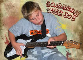
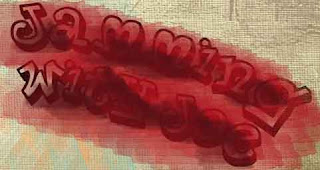
Here are the layers that created this image:

Layer 1 - Fill layer, tan
Layer 2 - Watercolor brushes, various colors, opacity 50%
Layer 3 - Text, Planet Benson 2 Font, Arced, tilted
Layer 4 - Two colors painted over the text in mottled pattern,
then clipped to text layer*
Layer 5 - Mesh texture layer
Layer 6 - Joey, cut away from the background, splatters
painted with layer 2 colors
Layer 7 - Mesh texture layer (copy), opacity 55%

*Clipping layers together applies the shape of the bottom layer to the pattern or color of the top layer.


In this image, I've added a new layer on top of the text and painted over the lettering. I like to use multiple colors to get more depth. Leave some areas open and the original color of the text will show through there.


Here, the painted layer was clipped to the text. Doesn't it look awesome?.

It's easy to do. In CS4 you select either layer, hold the alt key and hover your mouse between the two layers. The icon will change to a double circle. Click there and it's done. In Photoshop 7, you select the top layer and press CTRL+G to group or clip the selected layer with the one below it. If you don't have either of these, google how to do it in your software.

You can use this technique to clip photos to a shape, paint or texture to text and a world of other possibilities. Go play!

Thursday, July 9, 2009

Better Days

Katrina affected people who were many many miles from the devastation of the gulf coast. We did a mini photo journal of the storm damage that largely went un-noticed in rural Mississippi.

This is one of those images. I am drawn to architecture where Robert is drawn to nature photography. So our portfolios are drastically different. Yet each shows something that we all understand. Loss. For me, this journey showed the loss of historical buildings that residents hardly even see anymore. Many of the places in my shots were torn down in the cleanup days and they are gone forever.

We did clipping masks in class today. The same as I did on the Make it Last post earlier this week. She showed us a different way of clipping the layers together (CS4 is different than Photoshop 7). There are many ways to accomplish the same thing in Photoshop. Sometimes the way other people do it can save us some time.

Flesh Tones with Classic Ink

I got this stamp in a dollar bin somewhere. It's labels had been removed so I don't know who made it. It's red rubber mounted on wood and the rubber stains badly. I also had to condition it to get a good stamp impression out of it. All that aside, the girl is cute! Plus, it's a perfect way to show you one hue of flesh tone that you can get out of the Stampin Up Classic ink (pads or reinkers).

I used the pads because a drop of the reinker would be way to much. Squeeze the lids to transfer some ink from the pad to the lid before you open them. For this light skin tone we are using Creamy Caramel and Cameo Coral. Yes, you can mix them to get the shade you want!

Using your water brush, pick up some of the Cameo Coral color and bring it over to the Creamy Caramel lid and mix the colors there. Squeeze the brush a little to add water and thin down the intensity of the ink. Test on a scrap of the paper you will be using. You want a fairly large pool of color to finish your project without having to remix. Mine was the size of a half dollar (spread thinly over the surface of the ink pad lid).

Watercolor as usual, remembering to let it dry before moving on to other colors. You can add additional layers for shadows and straight coral for rosy cheeks. When you finish, use a tissue to clean the remaining mixed color out of your lid to keep pure color in the ink pad.


Paper makes a difference. The first example was on Whisper White and this one is on Watercolor paper. Biggest difference, stamped image and the watercolor paper seemed to absorb more of the color than the Whisper White. Which makes sense.

Her hair uses Summer Sun, Crushed Curry (perfect mid tone) and More Mustard. The deepest shadows were added with Really Rust and I blended the yellow and red with Creamy Caramel.

Finally I added shadows to the white with Brocade Blue.

Ok, it's your turn. Show me your water colored images!

Wednesday, July 8, 2009

Precious Girl


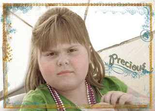
This was taken at the Jacksonville Beach Summer Jazz Series. Morgan and I tend to shelter from the sun under umbrellas. The light blew out the black of her umbrella and nearly washed this picture out completely.

Photoshop can color correct with no problems but in the class I'm taking I did something new today. We created a vintage hand tinted image. First I cropped the pic and reduced the saturation. A sepia tone was added and finally I colored her cheeks, lips, eyes and shirt on separate layers.

Then I added a frame from the class and used brush stamps to put the flourish under my title.

The text effect is not part of the class... or at least not that I know of. It's a pillow emboss after a white stroke was put on the text. (These are layer styles.) It makes it look like it's enameled. Fun fun.

Monday, July 6, 2009

Make it Last


Another shot from Joey's trip. This one featured a near silhouette of Joey with the setting sun sparkling over the water. It's a great shot. Perfect for a scrapbooking title too. So that's just what I did. All of this is digital, but you could do this as a hybrid as well. I'm printing it to use on my page as the title.

I used a grunge mat to rough up the edges and added text that I'd cut from a fiery piece of digital paper. The paper was made just for this shot and was recolored using the hue and saturation adjustments before being put in the background.

If you guys would like information on how to do this type of thing in photoshop or your own photo software, let me know in a comment and I'll post the info or email it to you.

Thanks for hanging out with me today!

Joey's Dream Weekend

Joey goes to Texas for the summer every year. They do all kinds of things while he is there. This year was something special though. They joined his uncle at the lake for the holiday weekend. Joey spent a lot of time on the boat or pier fishing. His dream weekend realized!

Wes just sent me some pics and I had to share this one with you guys. The frame and text are added in photoshop, along with a little edge darkening.

I'm taking the Jessica Sprague Frame-ups and Special Effects class. So far, nothing new for me, but I welcome the opportunity to learn. You never know where ideas and tips will come from.

Sunday, July 5, 2009

One Door Closes... and another opens

Well being out of work may turn out to be a good thing. A friend asked me to help her with her blog last week. If you have not met Sharon, she's a vibrant lady and fun person to be around. Now, Sharon has been maintaining her own blog and helping with a couple of other people's too. She is just very busy this month and wanted to convert to a three column layout. At the same time, we decided to do an update to her theme as well.

Here are the things I designed for Sharon:

BannerMenu BarSignature and Divider Bar Combo
Her blog is also sporting a custom background and she'll have a new watermark to match. Check it out! Be sure to leave her a note to let her know what you think of her new look!

Thank you Sharon for this opportunity and for generally just being there!

I'll be offering blog services at very reasonable rates. If you need a custom banner or a total blog setup, I would love to help you out.

Shadohart


Ok, I'm changing my profile to have a real picture of me. *GASP* I know I know... the camera didn't break or anything. So, wanted to keep am image of Shadohart on of the blog.

I carved this stamp a couple of years ago for the very first LTC swap. (That's Letterbox Trading Card for you non - letterboxers). It was one of my first carves and it's done from a sketch I did almost 23 years ago.

It's not farewell since I still have the stamp, but a little bit of goodbye since she's leaving your follower lists.

Thursday, July 2, 2009

Faux Handmade Paper


I have something really fun to share today. It's a technique I did a something like 20 years ago and then abandoned because I started making my own paper and didn't need it anymore. Well, with the new and fun reinkers I have now, I thought I'd give it another go. You may have seen this before and that's ok. I'm going to push the envelope a bit and see what we get.

This technique calls for craft or pigment ink reinkers. I don't have a lot of these on hand... ok.. I have white and gold. But I did it with acrylic paint before so I know I'm not limited to what people today say to do.

Supplies:
  • Classic Ink Reinkers in two coordinating colors*
  • White Craft Ink Reinker
  • Gold Craft Ink Reinker
  • CHEAP Toilet Paper (TP). It's got to fall apart when it gets damp. (think: dollar store)
  • Gloves, if you are squeamish about inky fingers
  • Glossy Card Stock - mine is a 2 x 4" piece
  • Plastic lid for a palate

*Coordinating means they are next to each other on the color wheel. Contrasting colors will work but you'll have brown real fast if you are not careful. I used blue and green.

Step by Step:
  1. Ball up several squares of TP
  2. Put a few drops of white ink in two different places on the palate
  3. Put one or more drops of classic ink down over the white*
  4. Use TP to mix one color and pounce onto card stock – leave spaces
  5. Use another ball of TP to mix and pounce the other color in the spaces
  6. Use third ball of TP to pounce gold ink sporadically over the whole project
  7. Let it dry! This is a very wet technique on a resistant paper. It’s going to take time to dry. Patience is good grasshopper.

During each step the TP should be falling apart and leaving small bits behind. This is good! When it happens, pounce over that area again to flatten the bits and cover it in ink

* The more ink you use the darker your color will be – I used one drop for a soft look


Troubleshooting:
  • TP is not falling apart – mist it with alcohol and rub it on scrap paper before you ink up to tear it up first
  • Colors too dark – you can go over it again with white to soften the look


Here’s the project I did with mine. The stamps are from Eastern Blooms, Circle Circus and a hand carved phrase. The scalloped circle motif was created using three of the Circle Circus stamps, punched and layered. Then I punched a scalloped circle through the card front and mounted the motif through the hole for perfect alignment.

The background circle, flower and doodles are done in Dusty Durango (another of the new colors) and the phrase and two of the stamps for the motif are in Rich Razzleberry. Yep, the doodle is done in the new color too. They come in markers and if you have not tried these: They leave Marvy’s in the dust and they are… *insert glorious angelic choir here* … refillable! *doing the happy dance

Ok, enough of my silliness. Come play with me and I’ll be happy to show you this and a billion other things floating around in the old noodle.

Wednesday, July 1, 2009

Yum on a Stick!

Don't you just love this vibrant color? I'm so excited about these new In-Colors from Stampin Up. This one is called Melon Mambo and so far, I think it's my favorite. The stamp is from the Circle Circus set. I cut it out with the circle scissor plus at 1.5 inches and then a 1.75 inch black mat.

The Stampin Up card stock is colored through and through. This means, you are never going to get those white edges when you cut it. This is a good thing, but it also means that sanding it isn't going to do anything. So, I embossed the Melon Mambo card stock with an embossing folder and my pasta machine. (need a big shot one of these days -- Santa, you taking requests?) But I still wanted the look of sanding on DSP. So I got out my Whisper White craft ink. A little dry sponging and voila~ Faux sanding.

A left over matted DSP and a little Sigmo Gel Pen later and Morgan declared it "Yum on a Stick!"

LinkWithin

Blog Widget by LinkWithin